Some time ago I created a post titled How to Create Printable Web Pages where I talk about using two CSS style sheets for a web site: 1 for the screen display and one for printing. I used the two style sheets when Technically Easy was on Blogger, but since then I never created a print-only CSS style sheet.
Since this blog is comprised of many tutorials and how-to guides, I decided I should provide the ability for a visitor to print a post without the sidebar, navigation bar and RSS subscription area taking up space on the printed page. As I thought about it, I figured I could provide a more flexible solution than just creating a print-only style sheet, so this post will explain how I manage to create a printable version of each post.
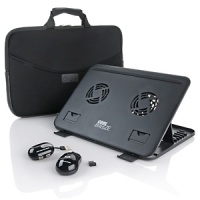
Modern laptops are miraculous devices in their own right. With a laptop, you can have the world at the fingertips at any moment through the internet. You can create documents wherever and whenever you want, or read and e-book, or play games. The extreme convenience of mobility has changed our society forever.
However, many people are unaware that laptops are capable of even more. There are many laptop accessories that improve a laptop’s performance, make it able to do more tasks, and increase its practical functionality. Here are a few of the most useful laptop accessories.
Most of the uses of web cams are obvious. They allow a laptop user to provide a streaming video from their location or elsewhere. They can also be used to record videos or take pictures. Most commonly, they are used in video chat applications like Skype. A decent web cam can now be purchased at a very reasonable price, and is very easy to install. Many simply need to be plugged into a laptop USB port, and then they’re ready to go.
Some laptops generate a lot of heat, especially high performance ones that are processing a lot of tasks and information at once. This can be extremely uncomfortable if you use your laptop where it traditionally belongs—on top of your lap. Cooling pads are used to provide a barrier between the extreme heat radiating from a laptop and your flesh. They also cool the laptop itself, decreasing the odds of it overheating and getting damaged.
Sometimes, using the touch pad on a laptop can be very inconvenient and impractical. For those of us used to the traditional computer mouse, there are now options available for laptops. Using a wireless mouse is usually very easy. Simply plug in the USB receiver and the mouse is ready to go. And since most of them now operate on laser motion trackers rather than a spinning ball, you can use them on almost any nonreflective surface.
Even the sturdiest laptops are usually pretty delicate. A well-padded carrying case can make the difference if a laptop is dropped, which happens most during simple transportation anyway. A good carrying case can definitely be a worthy investment.
Adding accessories to your laptop can help you be more productive or provide more flexibility to help you get your work completed.
H264 has been the bratty high school cheerleader for a while now; it’s popular just because it is. It produces very small compact file sizes (no one likes a fat cheer leader) and it doesn’t compromise on quality (no one likes an ugly cheer leader either). Like any popular cheerleader, this codec also comes with a trust fund and some very over protective parents. Okay the analogy is starting to get silly now.
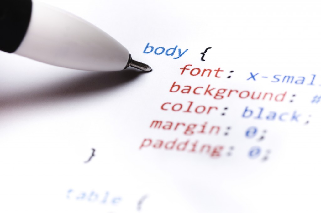
Since I have been designing my own WordPress themes, I have learned a lot of create CSS-designed themes and how the various elements on a page interact with other elements. It has been frustrating at times to position elements in the correct locations, but it is because of this frustration that I have managed to learn how to create my themes.
The one common problem that I had when I started designing my themes, and it seems it is a common problem to many people, is that of my sidebar dropping below my content when displaying my page. The cause of this problem is that the widths of my content and sidebar divisions were larger than the entire container they were rendered in. I thought I had the calculated the widths correctly, but what I thought was the width, wasn’t the true width of the elements. This post explains how you can easily debug such a problem.
A Few Things To Help Follow Along
I find that the best way to learn is to do things myself. I will be showing you some HTML/CSS code in this example, as well as using a Firefox extension. So you can also try things for yourself, you should use the following steps:
Download this example HTML file (in zip format), and then extract it to any directory on your local computer. Once downloaded, open the HTML file in a text editor, as well as opening the file in FireFox.
Once you have done the above steps, you can now follow along in this post.
The Width Example
In the example HTML file that was provided above, you will notice that there are three elements defined in the file (shown between the <style> tags), container, content and sidebar. The container element is the main container and will contain both the content and sidebar elements. The content is displayed on the left, while the sidebar is displayed on the right. You should see this in your Web browser.
You will also notice that each element has a defined width attribute. The container element has a width of 900 pixels, the content element is 600 pixels wide, and the sidebar element is 300 pixels wide. As it stands, you should be seeing the content element and the sidebar element side-by-side, because they have a combined width that is equal to the width of the container – 900 pixels.
To show this fact in Firefox, use the following steps:
Right-click the text in the content section and select “Inspect Element”. A new window on the bottom will open. Stretch the bottom window up if you don’t see much of it.
On the left of the window is the HTML code, while on the right is the information about the selected element. On the right, click the “Layout” option. This will display a boxed representation of the selected element.
The layout diagram for the three elements is shown (combined), in the image below.
Example Elements Layout Diagram (Click to enlarge)
By clicking on the container, content, and sidebar elements you can easily see the width of the elements in the Layout diagram. Let’s make some changes to the CSS to see the impact.
When Width is Not What You Think
The width defined in the CSS styles is not always what you think it is. The width that you define in the stylesheet is the width that will contain the contents of the element, but it isn’t the total width of the element.
To prove this point, make the following change:
[code language=”css”]
#content
{
background-color:#ccc;
float:left;
padding:1px; /* Make this change */
margin:0;
width:600px;
}
[/code]
Now refresh the file in the Firefox browser. What you will now notice is the content element is above the sidebar element.
In the left Firebug window, click on the content element. The layout diagram in the Firebug window still shows the content element as having a width of 600 pixels. If the width didn’t change, how come the content and sidebar elements are no longer beside each other?
The total width of the content element has changed with the addition of the padding. We have added 2 pixels of padding (1 pixel on the left and right) to the element, so the true width of the content element is now 602 pixels and not 600 pixels.
You can now see the additional 1 pixel padding in the layout diagram of the Firebug window to the left and right side of the content element. The layout diagram that indicates the padding is shown below.
Content Element With 1 Pixel Padding (Click to enlarge)
Adding the width of 300 pixels to the sidebar to the 602 pixels for the content gives a total width of 902 pixels, which is now wider than the container width of 900 pixels. Because of this, the sidebar element is “squeezed” out of alignment, and is now below the content.
If you were to change the margin attribute of the content element to 1 pixel instead of the padding attribute, the result would be the same. The same result would also happen if you were to add a border to the left or right of the content element.
Changing those same attributes (border, padding, or margin) of the sidebar element would have the same effect, as well.
Therefore, the true width of an element is defined as:
true width = [width] + [border (left and right)] + [padding (left and right)] + [margin (left and right)]
By using the Layout option in the Firebug extension for various elements, you can easily see the values for the above calculation for any element. You simply add them up to get the total width of an element.
The next example shows how we can determine the total width of an element when the three attributes are assigned. The CSS styling fo the content element is shown below.
Using the Firebug Layout window, we can now see that the total width of the content element is now 616 pixels. The diagram that shows the calculation is displayed below.
Content Element With Total Width Calculation (Click to enlarge)
If you are having trouble with displaying various elements side-by-side on you Web pages, you should use the Firebug Firefox extension to verify that the total width of the elements can fit properly in the containing element. By using the Firebug extension, along with its layout feature, you can easily calculate the width of the various elements by simply clicking on them in the code.
In the late 90s the biggest talk in the world of technology was always about Microsoft, and the products that they were releasing. Windows was the dominate force in operating systems, and Microsoft Office had a stranglehold on the office suite of products. Internet Explorer began challenging, and eventually surpassing, Netscape’s offering in the Web browser arena.
That was 15 years ago, and today things are much different. So different in that Microsoft seems to be an after thought when it comes to technology news. Apple and Google are now the companies that generate the most buzz in the headlines. They are releasing new products, and software on an almost weekly basis. With all the buzz surround these two companies, has Microsoft become a less relevant brand in the technology world?
Keeping your data safe online can seem hard since some of the biggest news in the technology world recently involves stories around hacking. The most infamous stories are about Sony and their lack of security when it comes to managing their client’s accounts for it’s services. Other stories include the hacking of the FoxNews.com Twitter account to the CIA. The hacking groups behind the hacking have published user names and passwords of thousands of individuals once they have received the data from various hacking attempts.
When it comes to security, the responsibility not only lies with the corporations managing the data, but also with the clients of the corporation. Each company must ensure that they do what is necessary to keep the data of their clients secure. At the same time, each client must also take necessary steps to protect themselves in the event of a security breach.
How many businesses do you think have a website? 75, 80 percent? It’s 2011, everything’s online, so of course most businesses are going to be online too, right? Wrong.
Only 45 percent of small business owners have a website, according to a recent study by Discover. And while that was a significant increase from the 37 percent in 2009, there are still a significant portion of the driving force of our economy that aren’t cashing in on all the potential the Web can offer.
Social media has become an integral part of every business plan. In fact, businesses that aren’t using social media platforms can expect to fail due to lacking online visibility and customer loyalty. However, using social media isn’t always blissful. One wrong Post or Tweet can ruin your brand in a matter of seconds. In the last year alone, large companies such as United Airlines and Chrysler have taken a beating because of poor social media management.
Disgruntled employees and angry customers can quickly take their thoughts to the web which can tarnish your brand for life. But a social media disaster doesn’t mean you should shut your doors for good. In fact, even those who have suffered from a disaster are still able to recover.


