Since I have been designing my own WordPress themes, I have learned a lot of create CSS-designed themes and how the various elements on a page interact with other elements. It has been frustrating at times to position elements in the correct locations, but it is because of this frustration that I have managed to learn how to create my themes.
The one common problem that I had when I started designing my themes, and it seems it is a common problem to many people, is that of my sidebar dropping below my content when displaying my page. The cause of this problem is that the widths of my content and sidebar divisions were larger than the entire container they were rendered in. I thought I had the calculated the widths correctly, but what I thought was the width, wasn’t the true width of the elements. This post explains how you can easily debug such a problem.
A Few Things To Help Follow Along
I find that the best way to learn is to do things myself. I will be showing you some HTML/CSS code in this example, as well as using a Firefox extension. So you can also try things for yourself, you should use the following steps:
- If you don’t have it installed, install the Firefox Web browser, open Firefox and then install the Firebug extension.
- Download this example HTML file (in zip format), and then extract it to any directory on your local computer. Once downloaded, open the HTML file in a text editor, as well as opening the file in FireFox.
Once you have done the above steps, you can now follow along in this post.
The Width Example
In the example HTML file that was provided above, you will notice that there are three elements defined in the file (shown between the <style> tags), container, content and sidebar. The container element is the main container and will contain both the content and sidebar elements. The content is displayed on the left, while the sidebar is displayed on the right. You should see this in your Web browser.
You will also notice that each element has a defined width attribute. The container element has a width of 900 pixels, the content element is 600 pixels wide, and the sidebar element is 300 pixels wide. As it stands, you should be seeing the content element and the sidebar element side-by-side, because they have a combined width that is equal to the width of the container – 900 pixels.
To show this fact in Firefox, use the following steps:
- Right-click the text in the content section and select “Inspect Element”. A new window on the bottom will open. Stretch the bottom window up if you don’t see much of it.
- On the left of the window is the HTML code, while on the right is the information about the selected element. On the right, click the “Layout” option. This will display a boxed representation of the selected element.
The layout diagram for the three elements is shown (combined), in the image below.

(Click to enlarge)
By clicking on the container, content, and sidebar elements you can easily see the width of the elements in the Layout diagram. Let’s make some changes to the CSS to see the impact.
When Width is Not What You Think
The width defined in the CSS styles is not always what you think it is. The width that you define in the stylesheet is the width that will contain the contents of the element, but it isn’t the total width of the element.
To prove this point, make the following change:
[code language=”css”]
#content
{
background-color:#ccc;
float:left;
padding:1px; /* Make this change */
margin:0;
width:600px;
}
[/code]
Now refresh the file in the Firefox browser. What you will now notice is the content element is above the sidebar element.
In the left Firebug window, click on the content element. The layout diagram in the Firebug window still shows the content element as having a width of 600 pixels. If the width didn’t change, how come the content and sidebar elements are no longer beside each other?
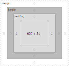
The total width of the content element has changed with the addition of the padding. We have added 2 pixels of padding (1 pixel on the left and right) to the element, so the true width of the content element is now 602 pixels and not 600 pixels.
You can now see the additional 1 pixel padding in the layout diagram of the Firebug window to the left and right side of the content element. The layout diagram that indicates the padding is shown below.

(Click to enlarge)
Adding the width of 300 pixels to the sidebar to the 602 pixels for the content gives a total width of 902 pixels, which is now wider than the container width of 900 pixels. Because of this, the sidebar element is “squeezed” out of alignment, and is now below the content.
If you were to change the margin attribute of the content element to 1 pixel instead of the padding attribute, the result would be the same. The same result would also happen if you were to add a border to the left or right of the content element.
Changing those same attributes (border, padding, or margin) of the sidebar element would have the same effect, as well.
Therefore, the true width of an element is defined as:
By using the Layout option in the Firebug extension for various elements, you can easily see the values for the above calculation for any element. You simply add them up to get the total width of an element.
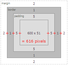
The next example shows how we can determine the total width of an element when the three attributes are assigned. The CSS styling fo the content element is shown below.
{
border:1px solid #000;
background-color:#ccc;
float:left;
padding:5px;
margin:2px;
width:600px;
}
Using the Firebug Layout window, we can now see that the total width of the content element is now 616 pixels. The diagram that shows the calculation is displayed below.

(Click to enlarge)
If you are having trouble with displaying various elements side-by-side on you Web pages, you should use the Firebug Firefox extension to verify that the total width of the elements can fit properly in the containing element. By using the Firebug extension, along with its layout feature, you can easily calculate the width of the various elements by simply clicking on them in the code.


