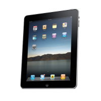
With Amazon’s Kindle competing with iPad 2 tablets are here to stay.
Although most tablets’ screen resolution matches that of the desktop, yet a different version is required for tablets? This is mainly to improve the user experience.
We use mouse clicks and keyboards for desktops while with tablets, we use finger sweeps and on-screen keyboards.
To succeed in this ever growing space, you’ll need to serve a touch optimized version of your website.
So what makes tablet optimization different from optimization for desktop users.

- While most tablets support flash, the most popular one – ipad does not. If you want your site’s content to render correctly on an iPad, then you’d better start converting the Flash content to HTML5.
- Use larger fonts and buttons – Tablets may have smaller displays than computer screens, but larger fonts work better as they are more user friendly on mobile devices. In addition make buttons finger-friendly and make them as large as possible. Offer a way for users to toggle between tablet view and normal view.
- The number of videos and animations affect the site speed. Do not overdo it with these. Use videos only if it adds to the user experience as too many videos can make it difficult for users on the go to have a good experience.
- Keep the checkout simple. Ask for as less information as it gets difficult for a user to type from a tablet and they may save the checkout for processing later if there is an overload of required information. As a result the checkout may never happen.
- Where you can give the option to download information instead of just leaving is on the site.
- Avoid paginated pages. Since scrolling down is pretty easy in tablets, you should opt for view all pages as much as possible.
However, if you already have desktop and mobile friendly versions of your site then just make sure that every page has a corresponding tablet friendly version which is served when a user browses using a tablet.
