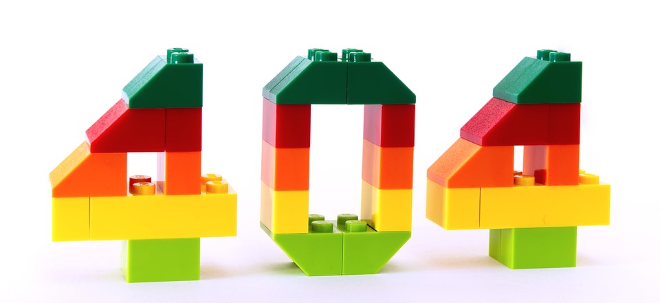
404 pages are the most undervalued element of website designing. Nobody likes to see the “page not found” message while searching for a product or information on a website. This type of inconvenience may drive away the regular visitors of your website as well as your new clients with dissatisfaction.
But it does not have to be this way.
You can turn this inconvenience into a pleasant experience by designing your 404 page in an aesthetic manner.
The main purpose of the ‘404 page’ is to navigate the user and point him or her where to go next. This can be done in a creative way which will ultimately allow you to retain your visitors.
Although, you should keep in mind that 404 errors could occur to any websites due to some technical errors. It would be wise if you prepare yourself in case such occasion arises.
What is a 404 error?
In the 21st century, most of us have already seen a 404 error page sometimes in our life. When you click on a link and that takes you to a 404 error page, it means, the current page you are looking for does not exist anymore or the server hosting that page might be down for the moment.
A 404 error page usually shows the visitor a message such as these: ‘HTTP 404 Not Found’, ‘404 Not Found Error’, ‘the page cannot be found’ or ‘The requested URL was not found on this server’, or other messages.
These messages could appear in two ways, either on a generic 404 page or on a custom 404 page. While generic pages pay no attention to designing, customs pages can be made to reduce visitors’ dissatisfaction and encourage them to check other pages of the website.
What to do?
When a visitor to your website does receive a 404 page, you should help the visitor find a more relevant page, or make your visitor’s visit more pleasant. Here are several ways you can do that.
Show a 404 page that can exhibit the personality of your business
If you are an interior decorator and you provide the service of coloring and decorating your customer’s home, then you can show an image of a beautiful colored wall with modern patterns. Make sure your image looks professional.
That way, a potential customer who may land on the 404 error page, will not get irritated when he looks at the sample work you have done on someone’s home.
You may show things that are pleasant to look at and arouse a minimum amount of curiosity. Off course, make sure they are related to the service you are providing. You can also hire additional help from http://www.lasvegaswebdesignco.com/ to appear more professional.
Be friendly
Instead of showing a message that almost looks robotic, you should use words with a human touch. For example, ‘OOPS’, ‘Yikes’ or an apologetic ‘Sorry’,proves that there is a human brain behind the page.
Usability
When the users land on an error page, they will eventually want to head back to the home page or leave the web site. You could provide a link to your homepage so that instead of leaving the site; they can go back to the homepage and find something else that suits their requirement.
You can also provide a search bar on the 404 page for their ease. Don’t forget to provide a contact link as well, so that the user can report the broken link to you.
Conclusion
Recent statistics have shown that engaging 404 pages could captivate a large amount of web traffic. It also has shown that simplicity and usability are the most two important factors for creating eye-catching 404 pages.
So, keep the aforementioned points in mind while designing.
