A few months ago I switched to Incapsula to help increase the performance of my blog and at the same time add an additional level of security. After testing out the service for several weeks I wrote my review about Incapsula, and in that review I mentioned that the dashboard and reports were comprised of flash objects. This caused both the dashboard and reports to load very slowly.
Since that review, Incapsula has contacted me about a new version of their service. The new version totally redesigns the entire dashboard and reporting feature of their service. I was offered to have a look at their new version, which I was very happy about, and have had a good look at their new version, which just went live. After using their new version for some time, I do have a few thoughts regarding the extensive changes that they have made.

Incapsula Adds Much More Reporting
The biggest change with the new dashboard is that the charts and other information is no longer displayed in various flash objects. The major benefit that I have seen is that reviewing information about my blog that is generated by Incapsula is no longer slow. All charts and information are displayed using HTML, which significantly increases the performance of their dashboard.
While the performance has increased, the amount of information that Incapsula provides in the dashboard has also increased. There are several reporting sections to the dashboard: Traffic, Threats, Performance, and Recent Updates. Each section provides information related to each section.
Traffic
(Click to enlarge)
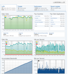
This section is the first one you will see when you view your dashboard. It is similar to what you will find in an analytics package – it shows your daily visits, and your visitor’s country breakdown. You can also see numbers that only your host would usually have – the amount of bandwidth you have used, and your bits per second transfer rate. While this section doesn’t replace your analytics package that you are currently using, it does provide a quick overview of your traffic for both bots and visitors, as well as how much bandwidth you are using.
Threats
(Click to enlarge)
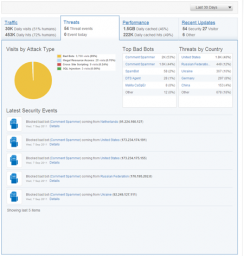
The Threats section is probably the most interesting aspect of your dashboard. Here you can see the threats that have occurred on your website over a period of time. The threats are broken down by type: bad bots, illegal resource access, cross site scripting, and SQL injection. The threat information is also broken down by country so you can see where many of the attacks against your website occur, as well as a report detailing the latest security events that have occurred. Based on this information, you can determine the type of action that you can take with each type of threat.
Performance
(Click to enlarge)
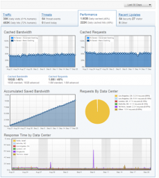
Next to the Threats tab you will find the Performance tab, which I’m sure you will find very interesting. Here you will see all the cached data that was served by Incapsula, and not by your host. This is good because it reduces the workload on you host, and increases the performance of your site. Cached bandwidth, cached requests and saved bandwidth is displayed here. Two charts are provided for information about the Incapsula data centers, which is where you content is cached and sent to your visitors. The response time graph is great to see how fast your site loads, and the requests by data center shows which data center is serving most of your content. For some reason, over 99% of my content is sent from one data center over the past 30 days. I’m not sure why, as I thought that my content would be sent more from various locations around the world.
Recent Updates
(Click to enlarge)
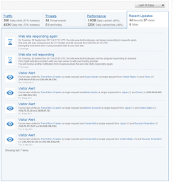
From looking at the recent updates it appears to be an information and news repository for alerting you to specific visitors and security information about your website. Information about various bots that visit your site is displayed here, and hovering your mouse over each bot will display information about the bot. This is a good feature added by Incapsula as many of us don’t know what each bot does.
Adjust the Reporting Date in Incapsula
The one thing that I like about the new version of Incapsula is the ability to adjust the date period for the information that is displayed. For the data option you have five choices – Today, Last 7 Days, Last 30 Days, Last 90 Days, Month to Date. I’m not sure how long Incapsula keeps your website visitor information, but if it is for an extended period of time, I wouldn’t mind seeing a sixth option that allows me to choose the start and end date.
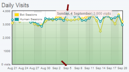
Overall, the tabs displayed on the Incapsula dashboard provide a lot more information than the previous version. The only thing that I noticed with the graphs is that when I hover my mouse over a point on the graph, the date of the point doesn’t correspond to the date in the X-axis. Because of this, I’m not sure which date the point represents.
(Click to enlarge)
Providing Information About Visits To Your Website
While the dashboard contains much of the information that you will be reviewing for your site, there is another section that display detailed information about each visit to your site.
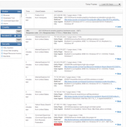
I like to review stats for my blog, and the visit section of the new Incapsula version has some nice stats for me to review. The most unique part of this page is that I can view the response time, and think time for each hit within each visit by clicking the “More” hyperlink. I find this to be useful as it shows, not only what is requested by a visitor, but also how long each file that is called takes to load.
(Click to enlarge)
If you have a site that gets a lot of visitors each day, then you can filter out the information that is displayed. By using the filter lists on the left, you can display information only for specific visitors, country, incident, or security threat. This definitely helps to clear out “noise” from the log if you are looking for specific information.
Final Thoughts
Overall I find the new version of Incapsula to be vastly improved over the older version. The service has been great, but I wasn’t a big fan of their reporting. With the new version, however, Incapsula has added a nicely improved reporting service to complement their great service.
