Dreamweaver is one of the favorite web development applications for developers. It is due to large numbers of available extensions. Users’ expectations are kept in consideration in these extensions and are also followed by developers around the globe.
Category: Websites and Blogging
This category will contain any blogging-related posts, that includes platforms such as WordPress and Blogger.
-

5 SEO Tips for the Technical Blogger
When I first started blogging almost four years ago, I didn’t know anything about SEO. I wrote posts that I thought were useful to others, and didn’t worry about researching keywords, keyword density, or even how the post would rank in search engines.
Being a technology-related blog, I knew that there was a lot of competition, in terms of SEO, with regards to many aspects of technology. I also knew that much of the content that is related to technology would be outdated. Today, however, I have realized a few things about SEO, and owning a technology blog, and have decided to sum them up in this post.
-

Best Strategies for Marketing Your Business Online
Effective marketing strategies are essential if your business website is going to thrive online. Ineffective strategies may generate little or not traffic to your website. In some cases, the traffic may flow in but poor targeting can result in few conversions.
These tips will help your website gain more online exposure to visitors who will be genuinely interested in the products and services offered on your site.
-

The Key to Succeeding Online: Adaptation
I just read an interesting article on John Paul Aguiar blog where he asked 8 well-known and successful bloggers what one thing bloggers need to do today to succeed that they didn’t have to do in the past. It is interesting read, as are all his articles, and it got me thinking about what it takes to succeed, not just today, but tomorrow as well.
There are many ideas, and theories, about what it takes to succeed online. Some of those ideas are well-founded, while others are guesswork at best. While I haven’t realized the success as the bloggers in John Paul’s article have achieved, I still have learned a lot in my almost 4 years of blogging. One thing, however, has stood out above all other ideas with regards to success online: adaptation.
-

Help! My Sidebar is Displayed Below My Content!
Since I have been designing my own WordPress themes, I have learned a lot of create CSS-designed themes and how the various elements on a page interact with other elements. It has been frustrating at times to position elements in the correct locations, but it is because of this frustration that I have managed to learn how to create my themes.
The one common problem that I had when I started designing my themes, and it seems it is a common problem to many people, is that of my sidebar dropping below my content when displaying my page. The cause of this problem is that the widths of my content and sidebar divisions were larger than the entire container they were rendered in. I thought I had the calculated the widths correctly, but what I thought was the width, wasn’t the true width of the elements. This post explains how you can easily debug such a problem.
A Few Things To Help Follow Along
I find that the best way to learn is to do things myself. I will be showing you some HTML/CSS code in this example, as well as using a Firefox extension. So you can also try things for yourself, you should use the following steps:
- If you don’t have it installed, install the Firefox Web browser, open Firefox and then install the Firebug extension.
- Download this example HTML file (in zip format), and then extract it to any directory on your local computer. Once downloaded, open the HTML file in a text editor, as well as opening the file in FireFox.
Once you have done the above steps, you can now follow along in this post.
The Width Example
In the example HTML file that was provided above, you will notice that there are three elements defined in the file (shown between the <style> tags), container, content and sidebar. The container element is the main container and will contain both the content and sidebar elements. The content is displayed on the left, while the sidebar is displayed on the right. You should see this in your Web browser.
You will also notice that each element has a defined width attribute. The container element has a width of 900 pixels, the content element is 600 pixels wide, and the sidebar element is 300 pixels wide. As it stands, you should be seeing the content element and the sidebar element side-by-side, because they have a combined width that is equal to the width of the container – 900 pixels.
To show this fact in Firefox, use the following steps:
- Right-click the text in the content section and select “Inspect Element”. A new window on the bottom will open. Stretch the bottom window up if you don’t see much of it.
- On the left of the window is the HTML code, while on the right is the information about the selected element. On the right, click the “Layout” option. This will display a boxed representation of the selected element.
The layout diagram for the three elements is shown (combined), in the image below.

Example Elements Layout Diagram
(Click to enlarge)By clicking on the container, content, and sidebar elements you can easily see the width of the elements in the Layout diagram. Let’s make some changes to the CSS to see the impact.
When Width is Not What You Think
The width defined in the CSS styles is not always what you think it is. The width that you define in the stylesheet is the width that will contain the contents of the element, but it isn’t the total width of the element.
To prove this point, make the following change:
[code language=”css”]
#content
{
background-color:#ccc;
float:left;
padding:1px; /* Make this change */
margin:0;
width:600px;
}
[/code]Now refresh the file in the Firefox browser. What you will now notice is the content element is above the sidebar element.
In the left Firebug window, click on the content element. The layout diagram in the Firebug window still shows the content element as having a width of 600 pixels. If the width didn’t change, how come the content and sidebar elements are no longer beside each other?
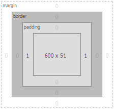
The total width of the content element has changed with the addition of the padding. We have added 2 pixels of padding (1 pixel on the left and right) to the element, so the true width of the content element is now 602 pixels and not 600 pixels.
You can now see the additional 1 pixel padding in the layout diagram of the Firebug window to the left and right side of the content element. The layout diagram that indicates the padding is shown below.

Content Element With 1 Pixel Padding
(Click to enlarge)Adding the width of 300 pixels to the sidebar to the 602 pixels for the content gives a total width of 902 pixels, which is now wider than the container width of 900 pixels. Because of this, the sidebar element is “squeezed” out of alignment, and is now below the content.
If you were to change the margin attribute of the content element to 1 pixel instead of the padding attribute, the result would be the same. The same result would also happen if you were to add a border to the left or right of the content element.
Changing those same attributes (border, padding, or margin) of the sidebar element would have the same effect, as well.
Therefore, the true width of an element is defined as:
true width = [width] + [border (left and right)] + [padding (left and right)] + [margin (left and right)]By using the Layout option in the Firebug extension for various elements, you can easily see the values for the above calculation for any element. You simply add them up to get the total width of an element.
The next example shows how we can determine the total width of an element when the three attributes are assigned. The CSS styling fo the content element is shown below.
#content
{
border:1px solid #000;
background-color:#ccc;
float:left;
padding:5px;
margin:2px;
width:600px;
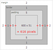
}Using the Firebug Layout window, we can now see that the total width of the content element is now 616 pixels. The diagram that shows the calculation is displayed below.

Content Element With Total Width Calculation
(Click to enlarge)If you are having trouble with displaying various elements side-by-side on you Web pages, you should use the Firebug Firefox extension to verify that the total width of the elements can fit properly in the containing element. By using the Firebug extension, along with its layout feature, you can easily calculate the width of the various elements by simply clicking on them in the code.
-

5 Dreadful Mistakes that Must be Avoided by a Web Design Company and a Website Designer
If you are a website designer you might be planning to make another grand website that you fancy will captivate a great mass of visitor’s attention. Indeed it will, depending upon the efforts you put into your work. You will be having in mind great design ideas that constantly tempt you to put your imagination into creation, an entity that is visible, admirable and tangible. But don’t be over anxious, it’s good to be enthusiastic but it may happen that some of your design ideas turn into dreadful mistakes that you repent over after creation. It’s not just the website designers who can make such mistakes; a web design company can also be prone to such mistakes. So what are these dreadful mistakes which must be avoided especially if you are planning to represent your business online? So here are we going to discuss them.
-

How CloudFlare Kept My Blog Running
I have been using CloudFlare for about 5 months. I mainly chose to look into using CloudFlare because of the performance benefits for my blog. CloudFlare is similar to a CDN in that it will cache many of the static elements on your site, such as images, Javascript, and CSS, and then send them to your visitors when they are requested. This means that your host’s server just needs to worry about sending the dynamic content, such as the Web pages, which reduces the load on the server.
Last week my host had an issue. There was a denial-of-service (DoS) attack against the server that hosts my blog. Because I am on a shared hosting plan, the DoS probably caused issues with several sites, and not just my blog

