Google’s latest algorithm updates have focused more and more on local search results. With local companies getting more focus in today’s search results, of course their websites will also be getting the same amount of new attention. The problem with that is, most local company’s websites are absolutely terrible.
Many smaller, local companies began putting up websites years ago before the new era of web design hit the web and before standards were really ever laid out for how a website should look. Many others simply put one up because they were told that is what they should do, and with little know how- put up a terrible looking site and then forgot about it because they never really saw any benefits from it. As a result, the web is filled with terrible looking sites for local businesses.

What makes a good small business website design though? A local drive in movie theater’s site looks like this. To be fair, it does have 3 columns, which beats many company’s sites, but it is filled with clutter, spammy looking pictures, animated backgrounds and just an assortment of outdated web methods.
This type of site is similar to what would have been made in the mid to late 90’s and maybe the early 2000’s. What is even better is, once the content ends, you have to scroll down through a long page of blinking stars to find out who made the site. Apparently the design company forgot to update it.
Obviously blinking backgrounds, animated gifs, scrolling marquees, and other outdated nonsense do not make a good design. They make an embarrassing design. What constitutes a good design for a local business then?
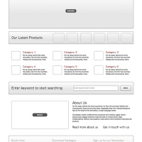
A local business website should be clean, crisp, concise and organized. On top of that, it should be able to give the viewer everything they need to know quickly and let them know they are at the right place.Scott Mullins, a LPA from the same area as the drive-in, knows how to get a website up and running that looks professional and meets all the needed criteria.
Upon going to their page, it instantly jumps out at you that it is organized and professional, unlike the other site which comes out as outdated and borderline comical. To help the viewers, it implements graphics and text effectively to show exactly what services are being offered and the information any client or potential client may need.
Its quick navigation links are at the top for an easy navigation system, versus the other site which has text all over the place and finding information fast is difficult. It then uses images to show what is being offered and organized text to bullet point what is being offered and why it should be looked at.
The difference in the two sites is clear, while the purpose is the same. One effectively uses design techniques to get their message across while the other one uses design to stay out of date and disorganized.
Image credit: Sanjeev Sapkota.