The October 2013 Future of Web Design conference website illustrates the trends shaping the look of today’s digital interfaces. The site emulates the minimalist style of a mobile app display. Large rotating images and text dominate the layout, arranged to emphasize a prominent “Register Today” button.
Flat textures blend smoothly into a shadowless surface barely rippled by subtle gradients. A simple red and black scheme against a white background recalls traditional newspaper colors, suggesting that today’s trends are more rediscovery and redeployment than revolution. But whether innovation or imitation, the contours of today’s trends have assumed a clear shape over the past year.
The Mobile Design Imperative
Surging demand for mobile access drives today’s look, requiring websites to display across an ever-expanding range of wireless devices. Where the menu-oriented desktop paradigm once ruled, the tiled mobile look has emerged, reshaping even traditional interfaces like Windows. Moreover, mobile design must now encompass not only smartphones, but also tablets and phablets, and increasingly, interactive TVs, with smart kitchen and car interfaces on the horizon.
Responsive Web Design
The drive for a mobile-oriented look prompted Mashable to name 2013, “the Year of Responsive Web Design.” RWD brings together various vectors defining the mobile design mandate. The key imperative is a scalable design that displays across various screen sizes without losing resolution. To make this happen, pages, images and text must be sized fluidly, in relative proportions rather than absolute units.
Behind the scenes, this requires code to include “media queries” so that design elements adjust to the display device’s browser and screen size. It also means adapting delivery speed, WebHostingBlueBook.com explains, to accommodate wireless networks and standard bandwidth package parameters.
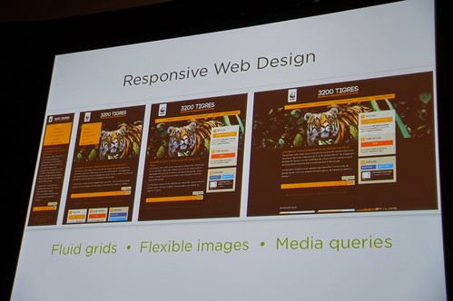
Photo by Flickr user Jeffrey
App Interfaces
In September 2012, USA Today celebrated its 30th anniversary by revamping its website to look like an iPad app, signaling the trend of mobile design. Simple, focused visuals define the new look. Typical features include fixed header bars, large tiled images and photo backgrounds. Supplementing this simplified appearance are streamlined navigational elements for easy interaction, such as minimalist menus, big buttons and transparent onscreen overlays.
Flat Look
Following Steve Jobs’ death in 2011, Apple reversed its traditional preference for 3D-simulating “skeuomorphic” designs and embraced the emerging “flat design” paradigm Microsoft had initiated with the launch of Zune in 2006.
The flat look removes three-dimensional elements such as shadow that simulate texture, as well as navigational features that mimic physical activities like clicking buttons and moving sliders. It replaces these with the look and feel of a smooth surface, which supporters argue better serves consistent mobile experience across multiple devices.
Responsive Typography
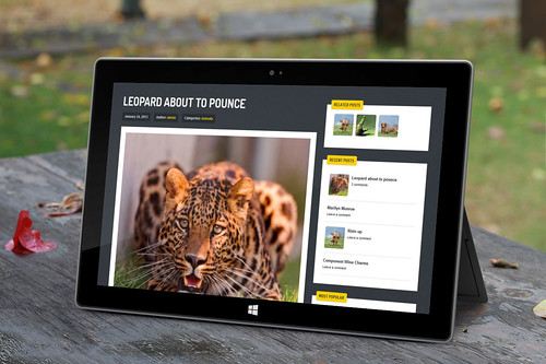
Streak, a responsive WordPress theme. Photo by Flickr user ZERGE_VIOLATOR
Web developer magazine .net awarded the browser-based font design tool Typecast its Game Changer of the Year Award in 2013, illustrating how today’s new look also encompasses text. Typecast’s emergence reflects the growing demand for fonts that display across multiple systems for viewing on all devices and browsers. All signs indicate that responsive text will be an increasingly important of responsible design as the new look continues to unfold.